Properties
Properties
name: String required
Info
Required for static modals, optional for dynamic modals.
Name of the modal, it is required property.
resizable: Boolean
Default:
false
Enables resizing of the modal.
resizeEdges: Array<String>
Default:
['r', 'br', 'b', 'bl', 'l', 'tl', 't', 'tr']
Can contain an array with the edges on which you want the modal to be able to resize on.
| string | direction | corner |
|---|---|---|
'r' | → | right |
'br' | ↘ | bottom right |
'b' | ↓ | bottom |
'bl' | ↙ | bottom left |
'l' | ← | left |
't' | ↖ | top left |
't' | ↑ | top |
'tr' | ↗ | top right |
resizeIndicator: Boolean
Default:
true
Enables the resize triangle at the bottom right of a modal when Resizable is enabled.
centerResize: Boolean
Default:
true
Enables automatic centering of the modal when resizing, if disabled modals will resize and remain in a fixed position similar to how Windows applications are resized.
adaptive: Boolean
Default:
false
Enable responsive behavior, modal will try to adapt to the screen size when possible. Properties maxHeight, maxWidth, minHeight, minWidth can set the boundaries for the automatic resizing.
draggable: Boolean | String
Default:
false
Allows dragging the modal within the boundaries of the screen.
Draggable property can accept string parameter - a CSS selector to an element which will be used as a "handler" for dragging.
<modal name="bar" draggable=".window-header">
  <div class="window-header">DRAG ME HERE</div>
  <div>
     Example
  </div>
</modal>
scrollable: Boolean
Default:
false
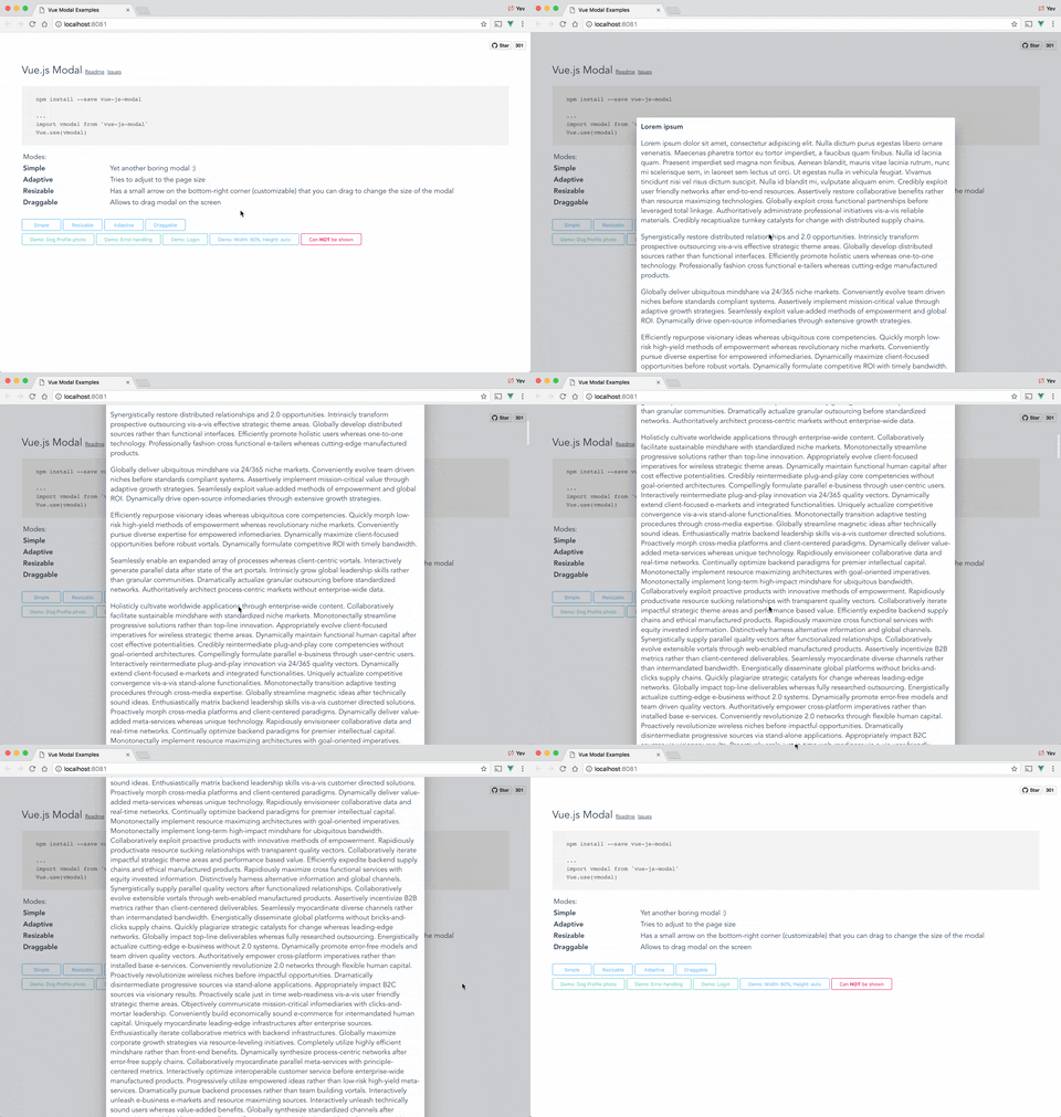
Enables scroll within the modal when the height of the modal is greater than the screen.
Note
This feature only works when height is set to "auto"
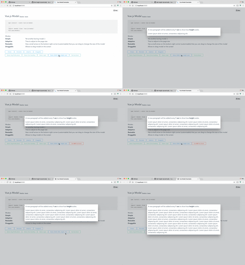
Show me some gifs
Auto height

Scrollable content & auto height

focusTrap: Boolean
Default:
false
Enables focus trap meaning that only inputs/buttons that are withing the modal window can be focused by pressing Tab (plugin uses very naive implementation of the focus trap)
reset: Boolean
Default:
false
Resets position and size before showing
clickToClose: Boolean
Default:
true
If set to false, it will not be possible to close modal by clicking on the background or by pressing Esc key.
transition: String
Default:
'vm-transition--modal'
CSS transition applied to the modal window.
overlayTransition: String
Default:
'vm-transition--overlay'
CSS transition applied to the overlay (background).
classes: String | Array
Default:
[]
List of class that will be applied to the modal window (not overlay, just the box).
styles: String | Array | Object
Default:
'''
Style that will be applied to the modal window.
Note
To be able to support string definition of styles there are some hacks in place.
Vue.js does not allow merging string css definition with an object/array style definition. There are very few cases where you might need to use this property, but if you do - write tests 😃
width: String | Number
Default:
600
Width in pixels or percents (50, "50px", "50%").
Supported string values are <number>% and <number>px
Note
This is not CSS size value, it does not support em, pem, etc. Plugin requires pixels to recalculate position and size for draggable, resaziable modal. If you need to use more value types, please consider contributing to the parser here.
height: String | Number
Default:
300
Height in pixels or percents (50, "50px", "50%") or "auto".
Supported string values are <number>%, <number>px and auto. Setting height to "auto" makes it automatically change the height when the content size changes (this works well with scrollable feature).
Note
This is not CSS size value, it does not support em, pem, etc. Plugin requires pixels to recalculate position and size for draggable, resaziable modal. If you need to use more value types, please consider contributing to the parser here.
minWidth: Number (pixels)
Default:
0
The minimum width to which modal can be resized.
minHeight: Number (pixels)
Default:
0
The minimum height to which modal can be resized.
maxWidth: Number (pixels)
Default:
Infinity
The maximum width of the modal (if the value is greater than window width, window width will be used instead.
maxHeight: Number (pixels)
Default:
Infinity
The maximum height of the modal (if the value is greater than window height, window height will be used instead.
shiftX: Number (between 0 and 1.0)
Default:
0.5
Horizontal position in %, default is 0.5 (meaning that modal box will be in the middle (50% from left) of the window
shiftY: Number (between 0 and 1.0)
Default:
0.5
Vertical position in %, default is 0.5 (meaning that modal box will be in the middle (50% from top) of the window.
loader: Boolean | String | { html: String, ?style: VueStyleBindings }
Default:
false
Info
For async components only.
By default, no loader is shown when loading async components. You can enable it by setting this property to one of the following values:
- If set to
true, default loading bars will be shown. - If set to a
String, the text will be shown instead of the default loading bar. - If set to an
Object, you can specify your own HTML and CSS styles.
Examples
Static modal:
<template>
  <modal
    name="example"
    :width="300"
    :height="300"
    :adaptive="true"
  >
    Hello, Properties!
  </modal>
</template>

<script>
export default {
  name: 'ExampleModal'
}
</script>
Async modal:
<script>
import { defineAsyncComponent } from 'vue'

const MyAsyncComponent = defineAsyncComponent(async () => import('./components/MyComponent.vue'))

export default {
name: 'Example',
  methods: {
    openModal () {
      this.$modal.show(
        MyAsyncComponent,
        {
          // additional props to pass to the component
        },
        {
          name: 'my-async-component', // optional
          height: 'auto',
          scrollable: true,
          clickToClose: false,
          loader: {
            html: '<div class="loader">Loading...</div>',
            style: {
              color: '#fff',
              backgroundColor: '#333'
            }
          }
        }
      )
    }
  }
}
</script>